_
EN
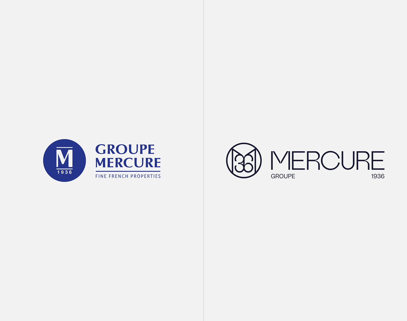
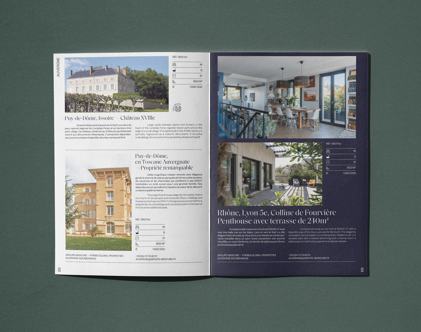
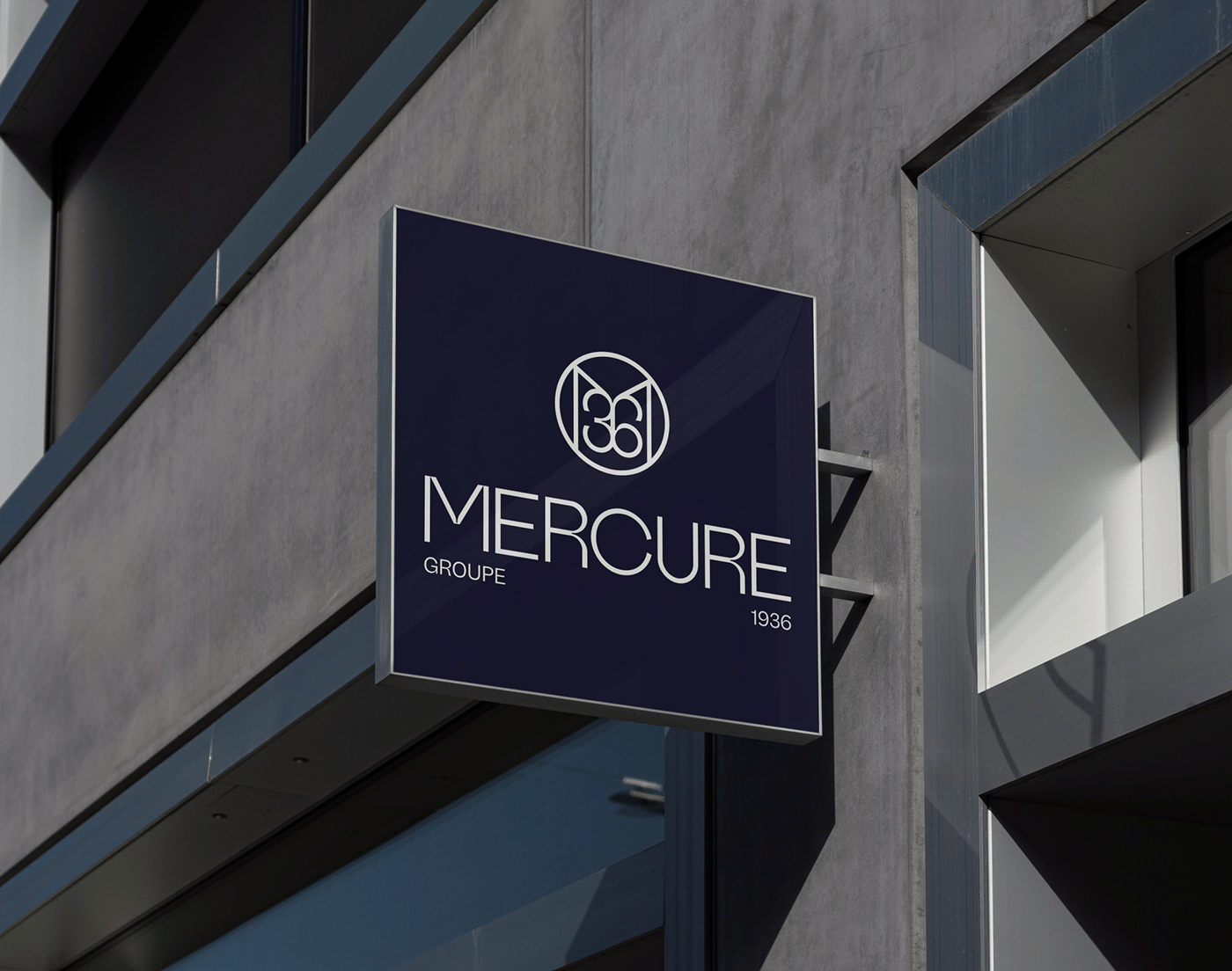
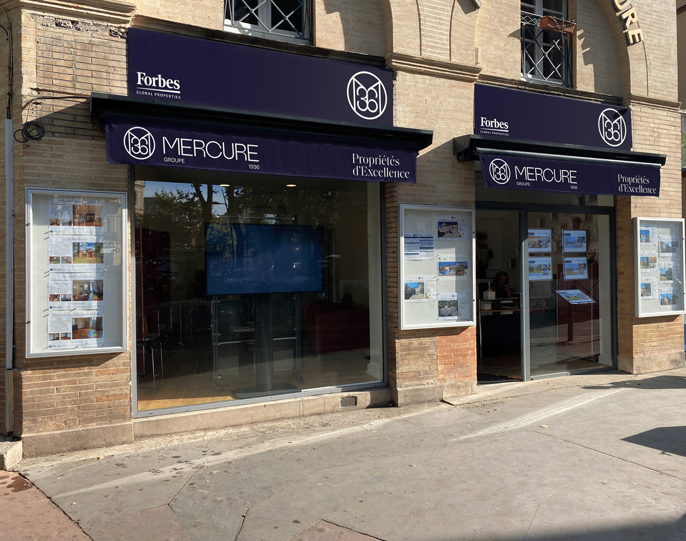
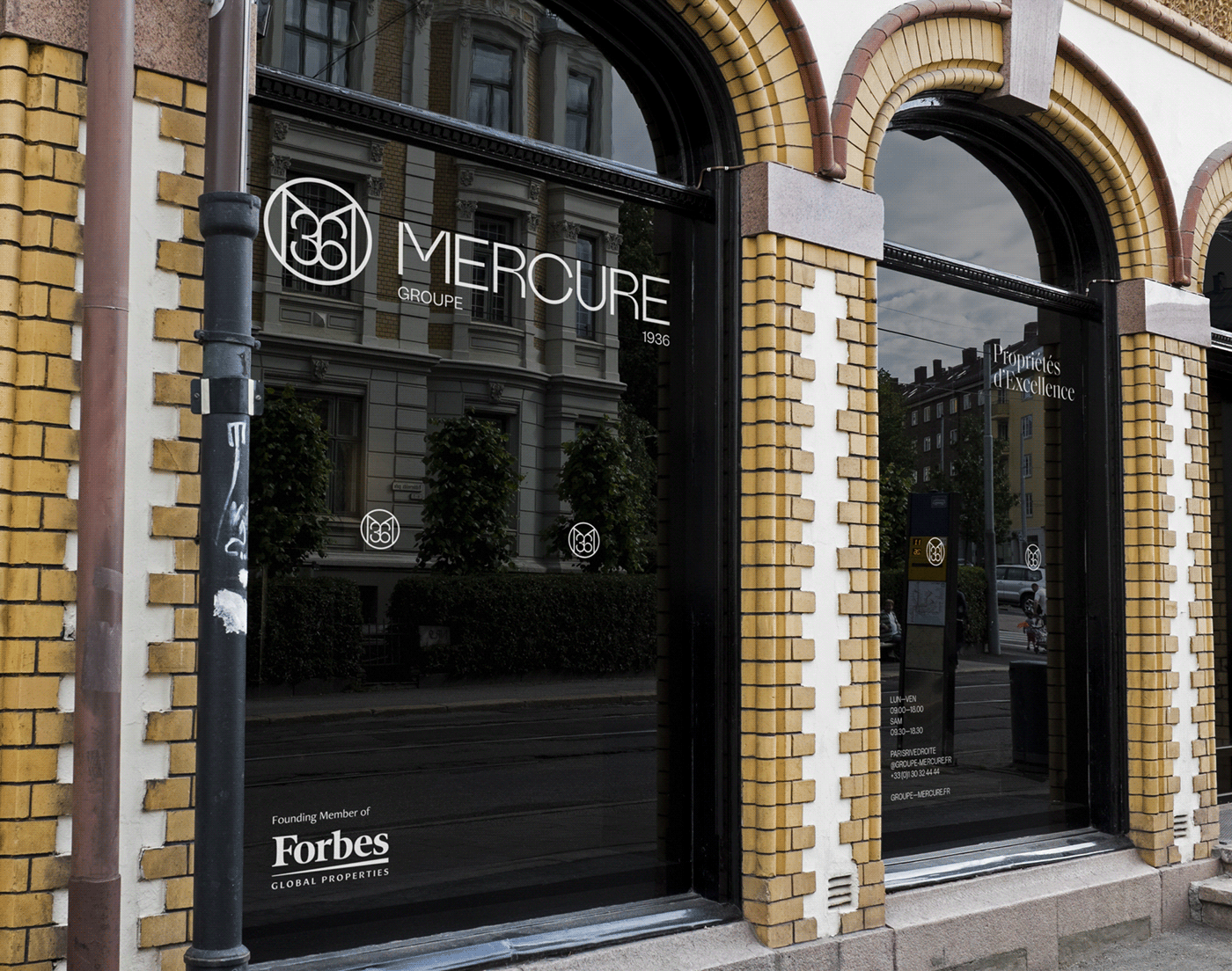
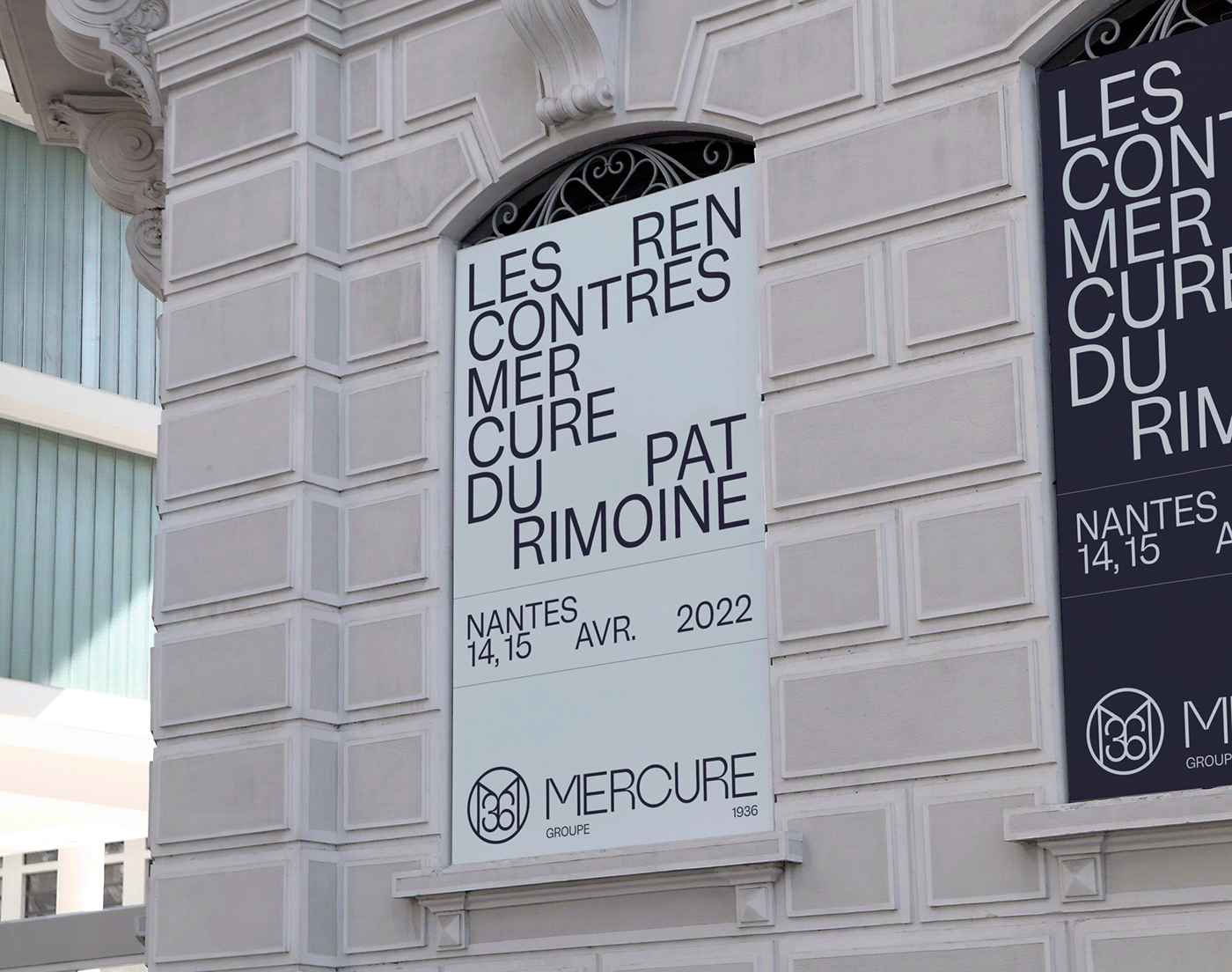
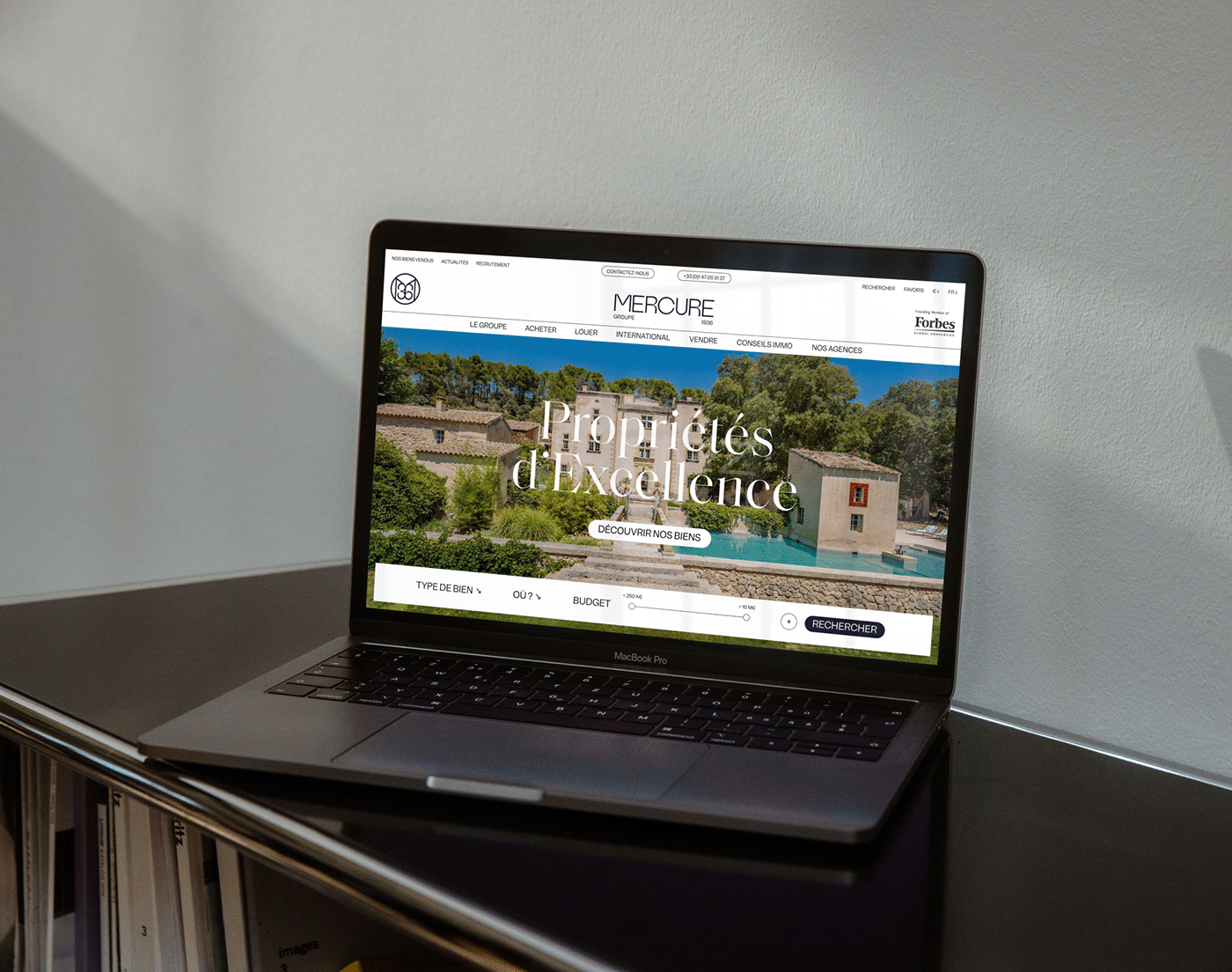
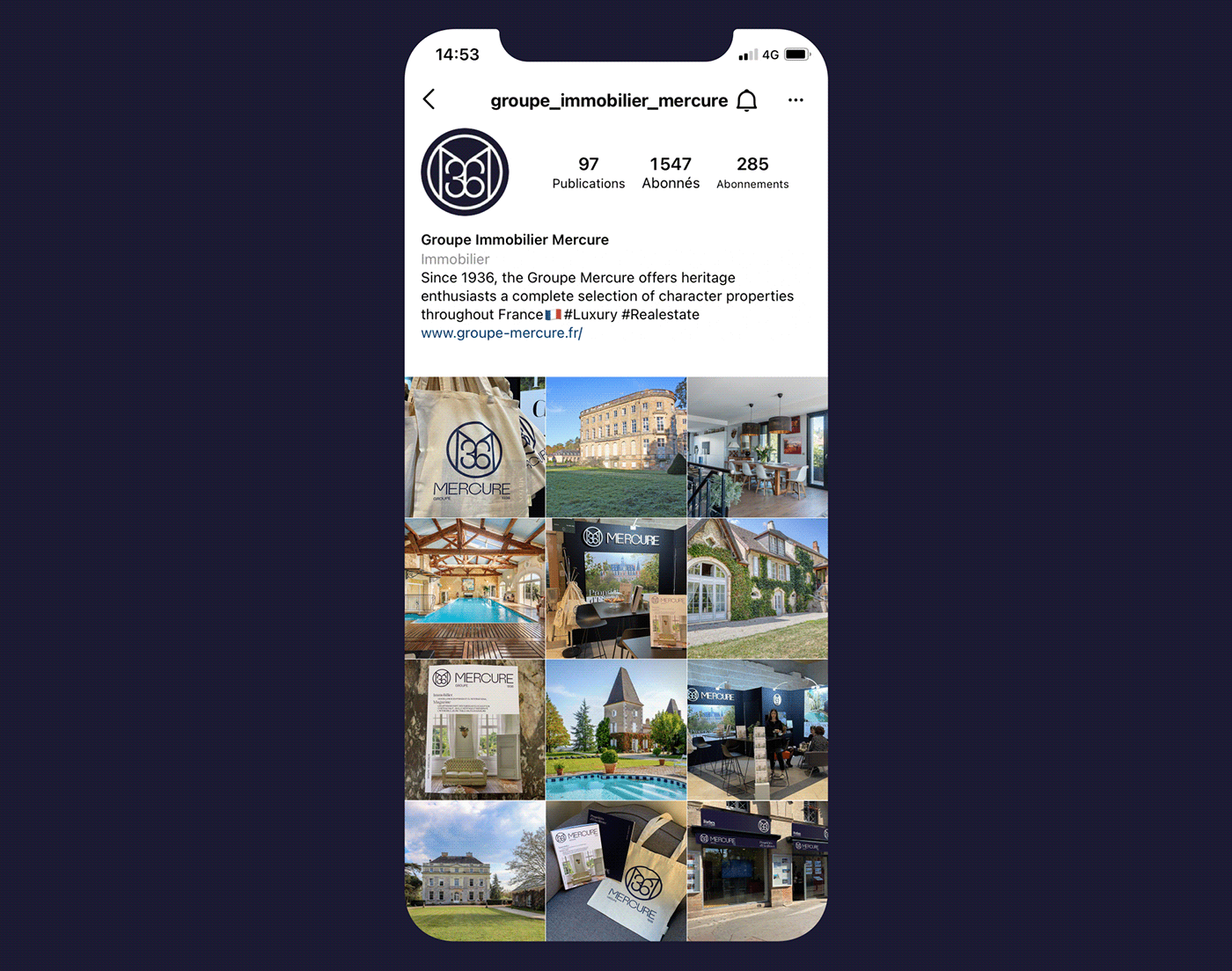
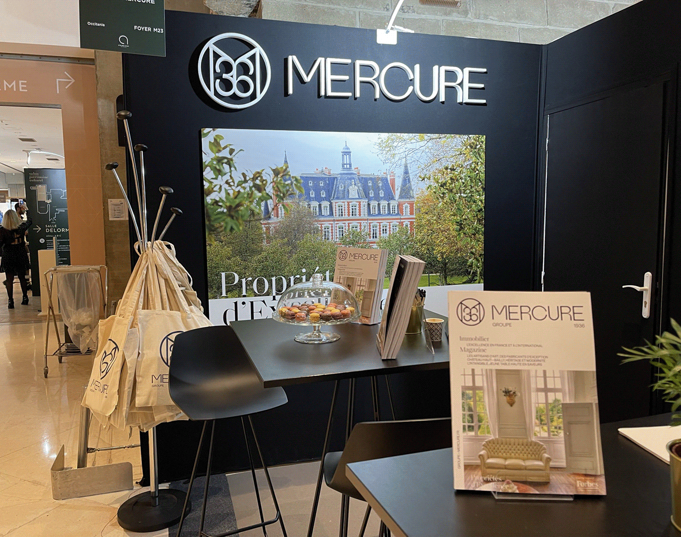
Groupe Mercure - Forbes Global Properties was created in 1936, and is one of the top 4 French real estate networks dedicated to the luxury market, with more than 2,000 character properties for sale in 20 agencies spread across the country. Moreover, it is the undisputed leader in the niche market of castle sales, concentrating more than 80% of the French inventory. In the spring of 2021, the group's top management asked our studio to completely rethink the brand's graphic identity, as well as its signature and visual system.
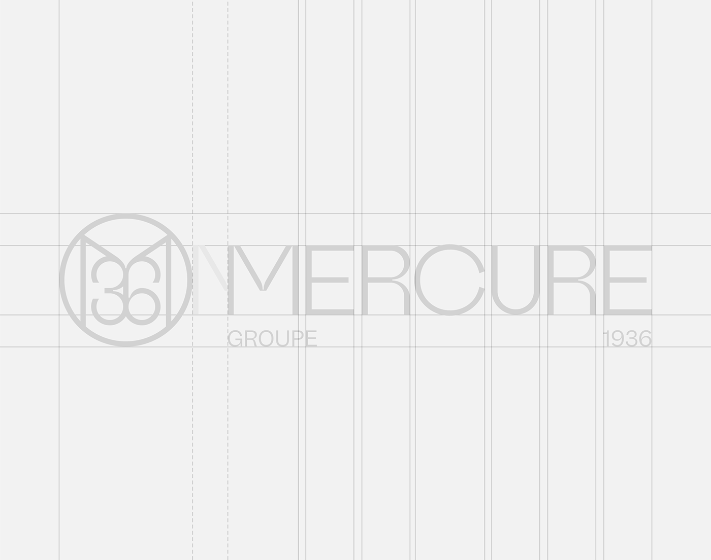
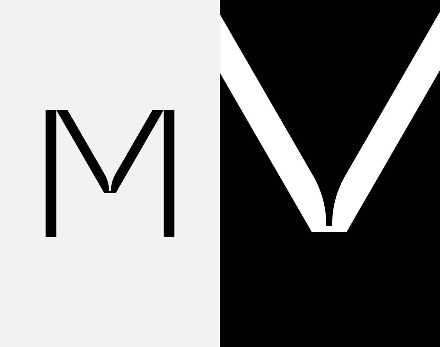
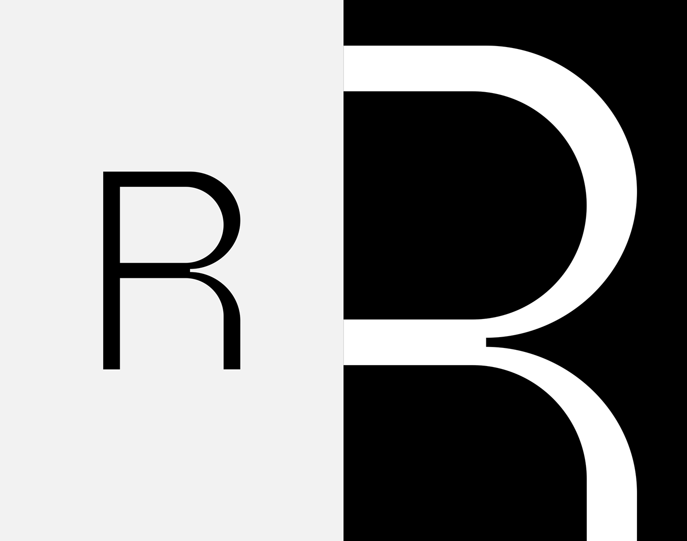
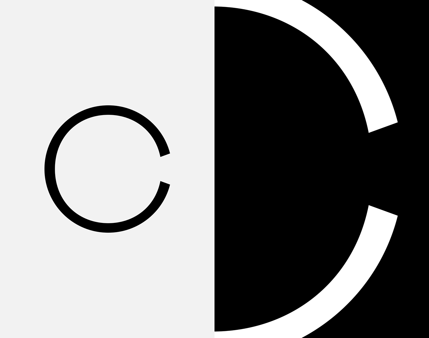
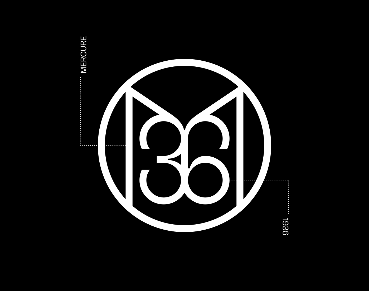
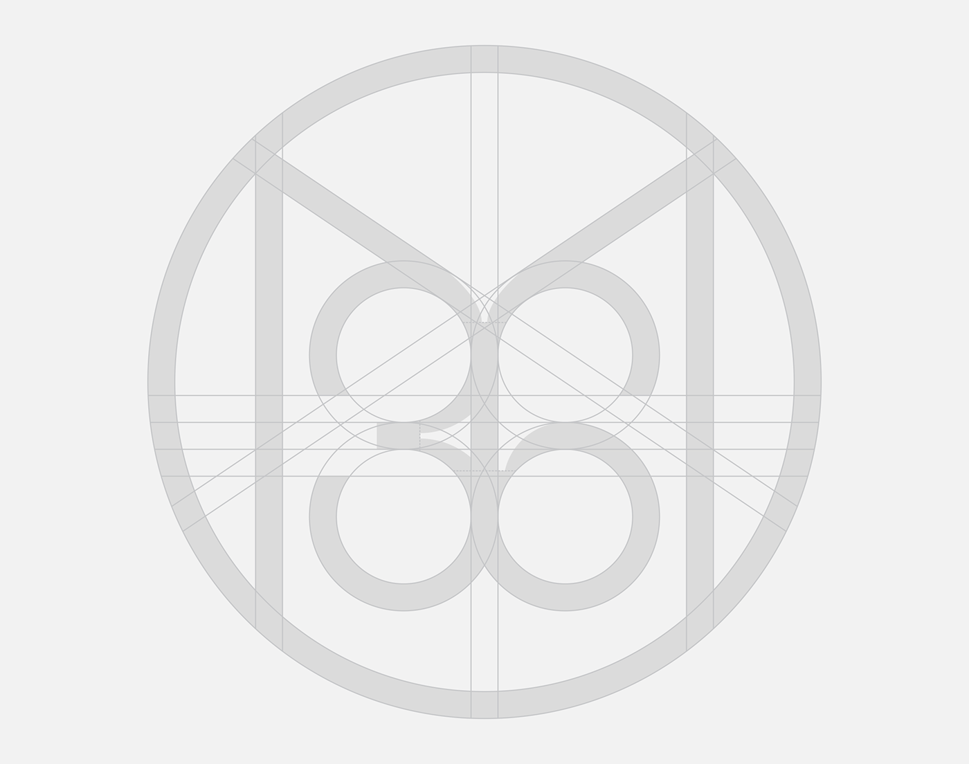
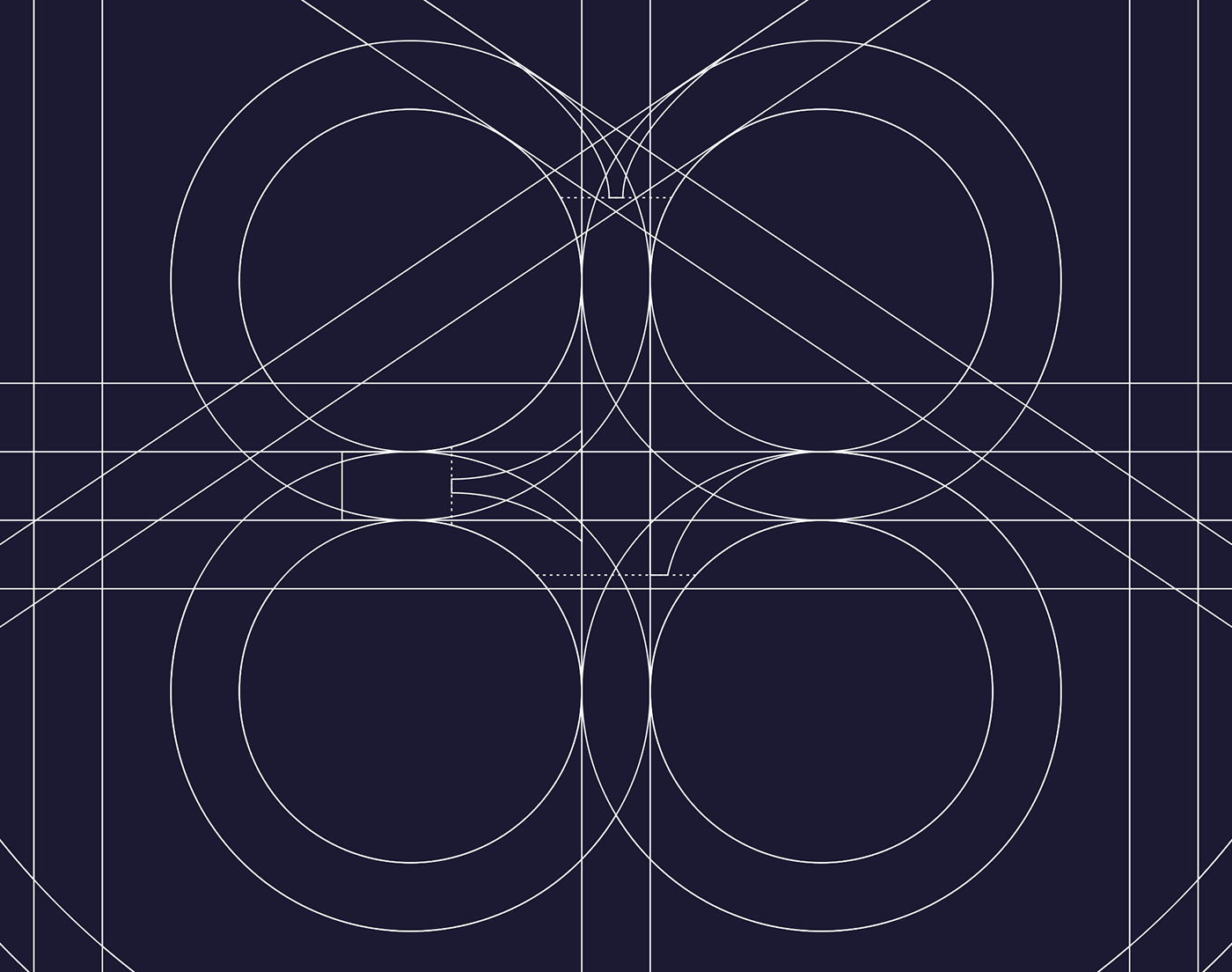
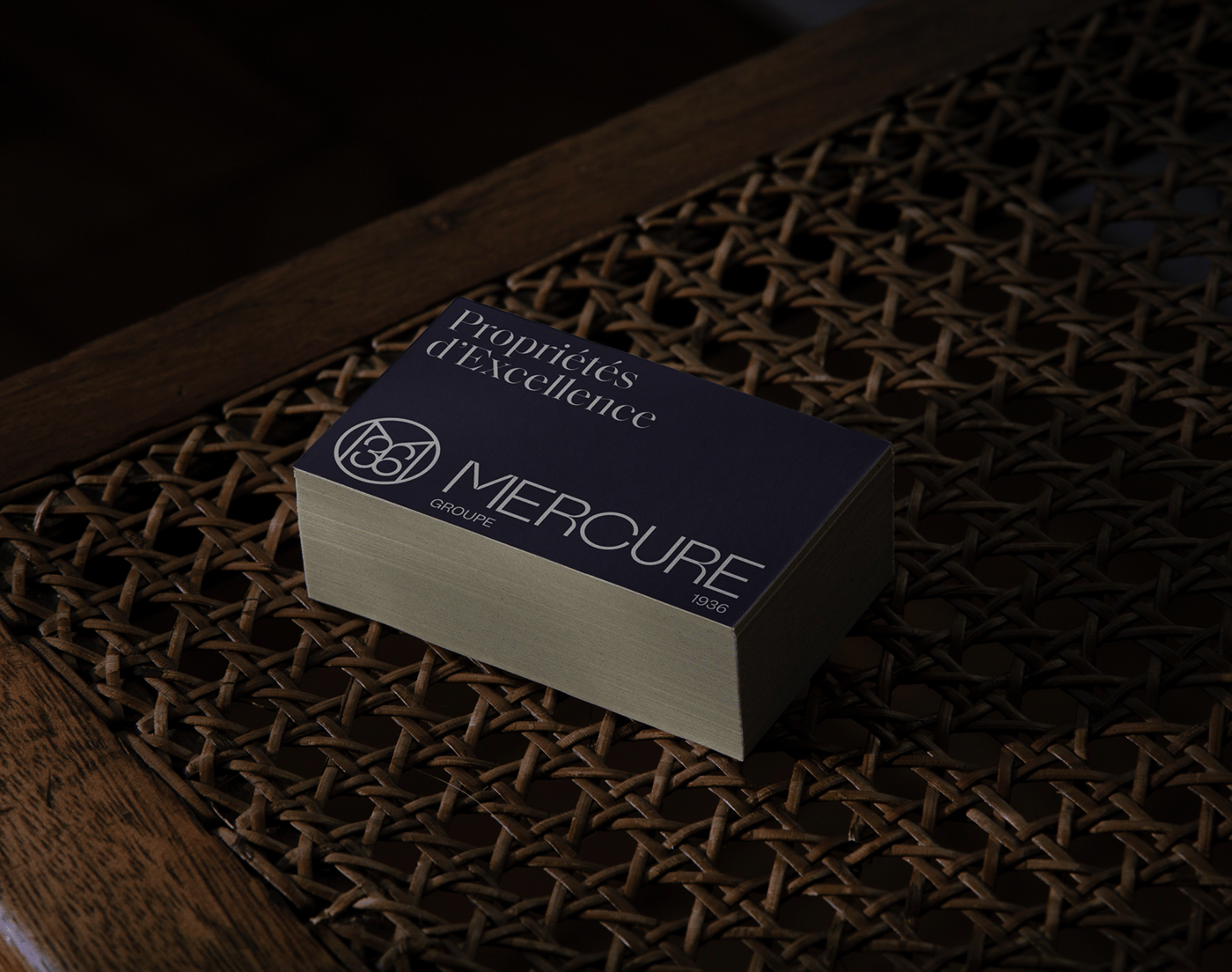
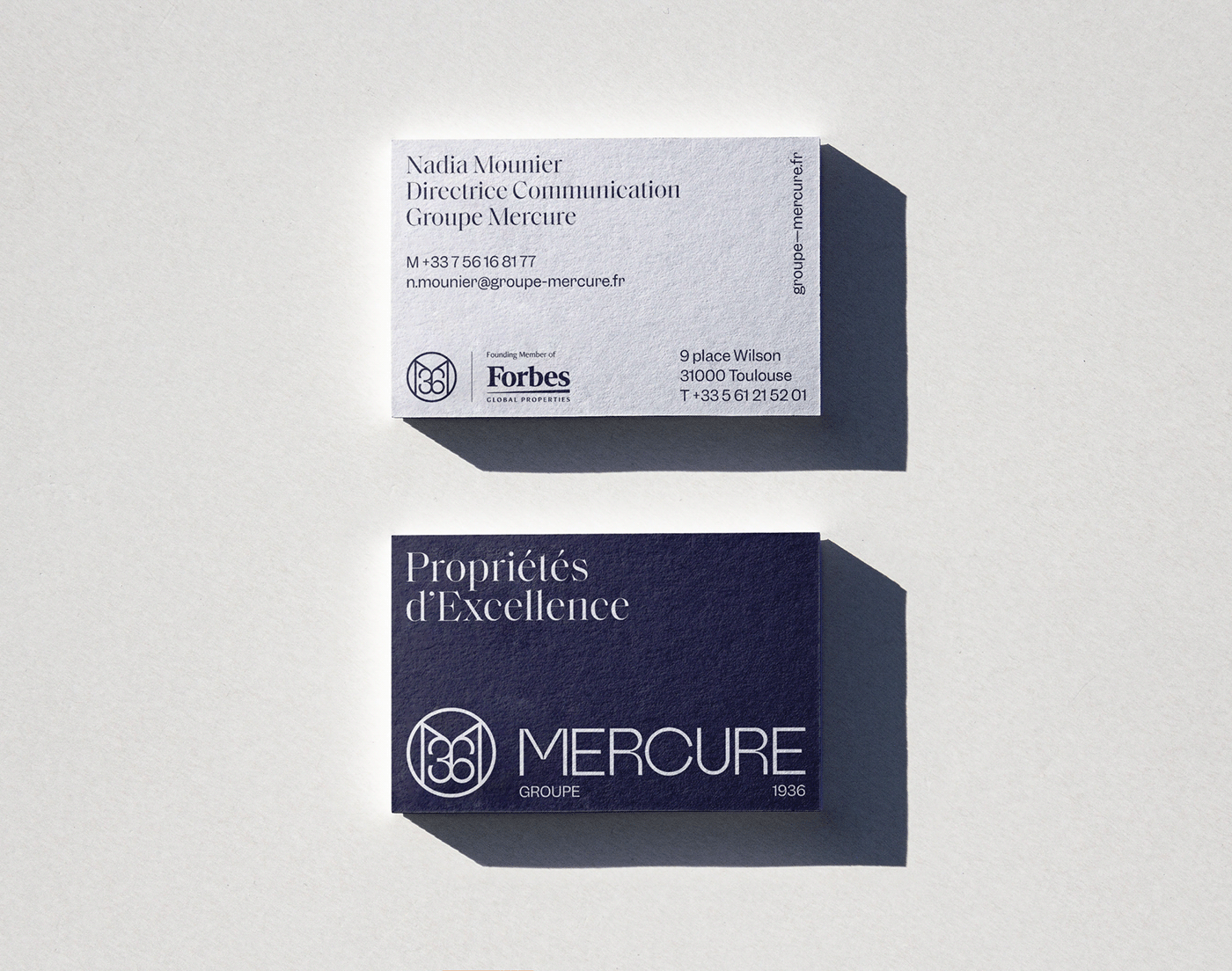
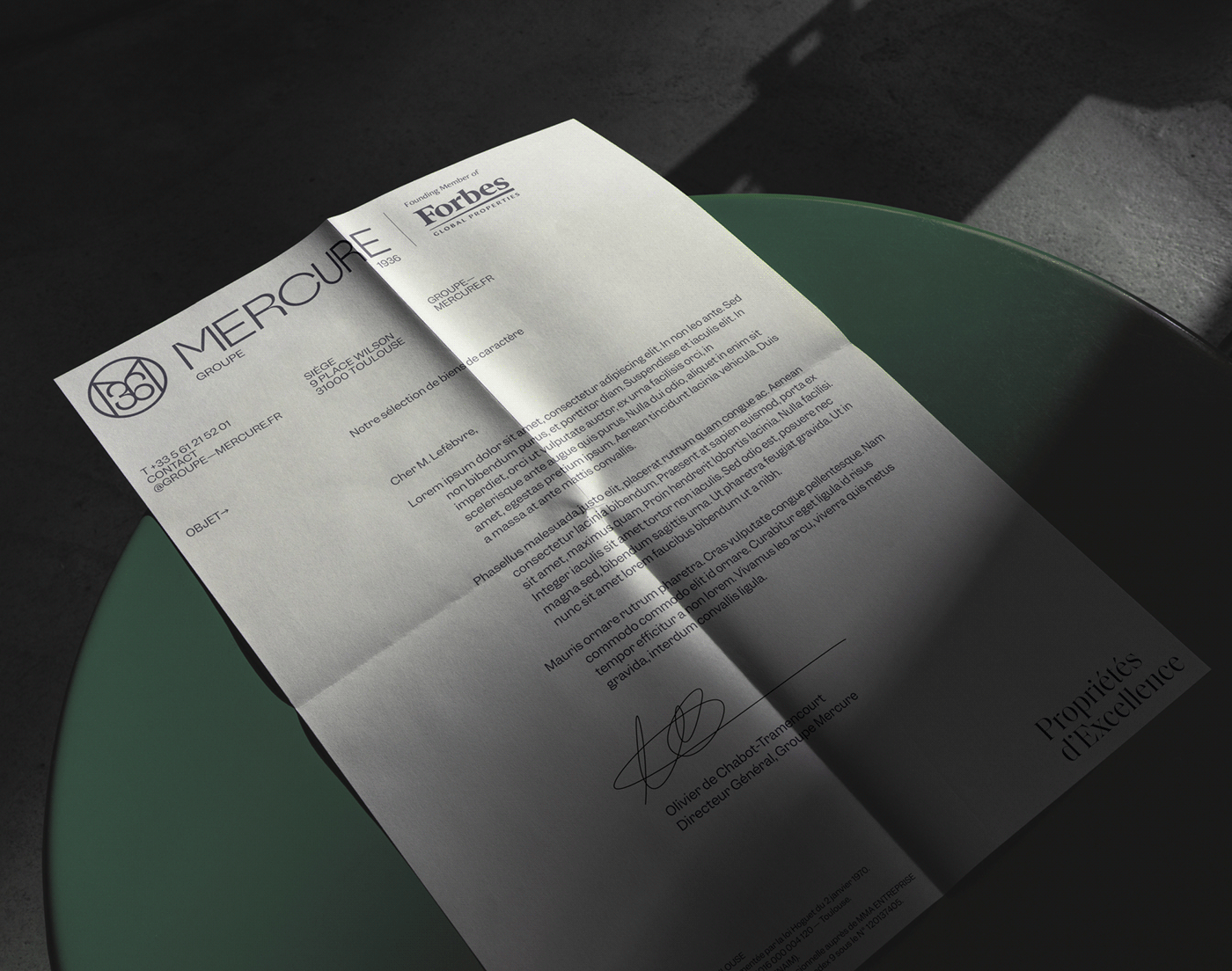
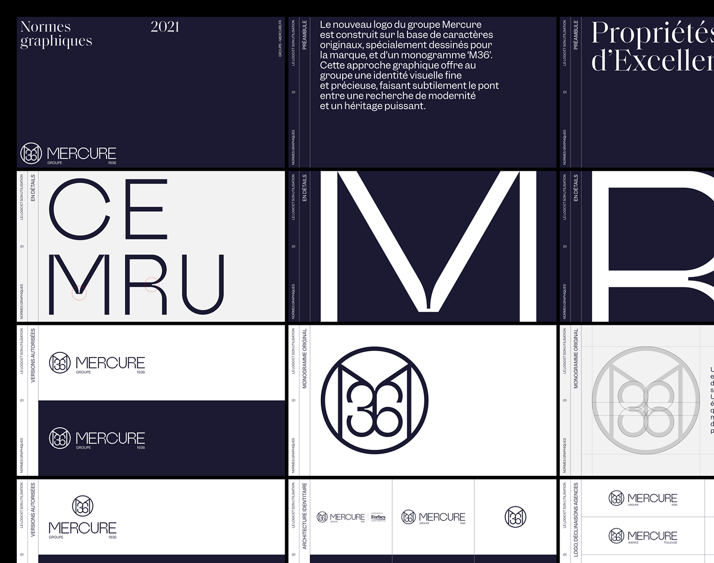
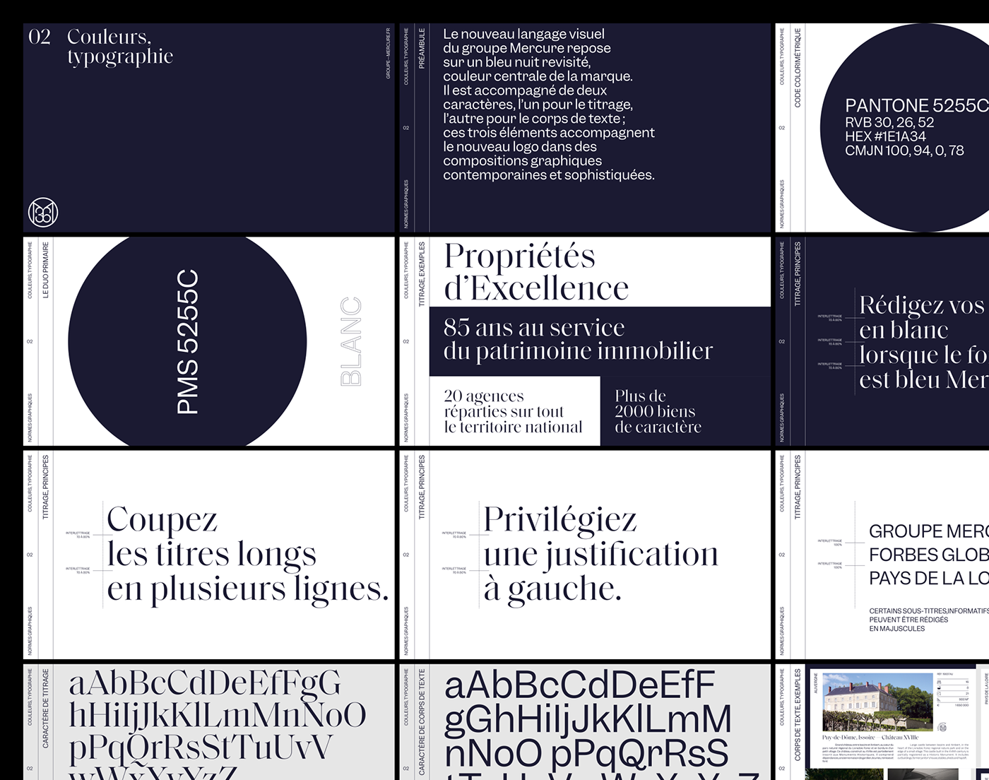
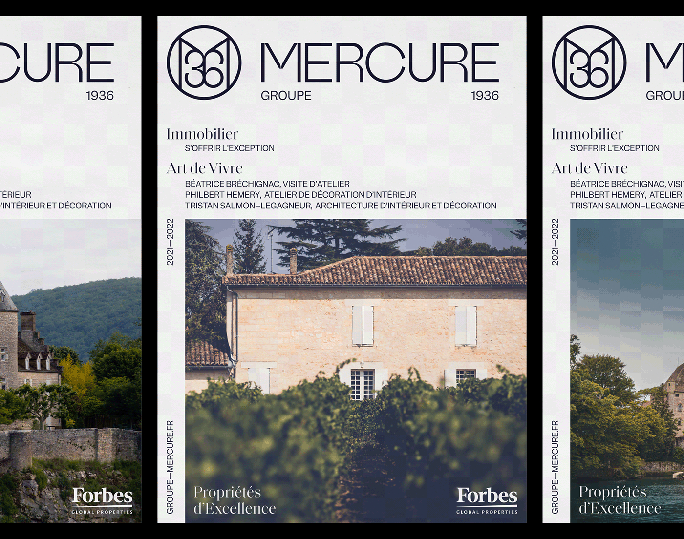
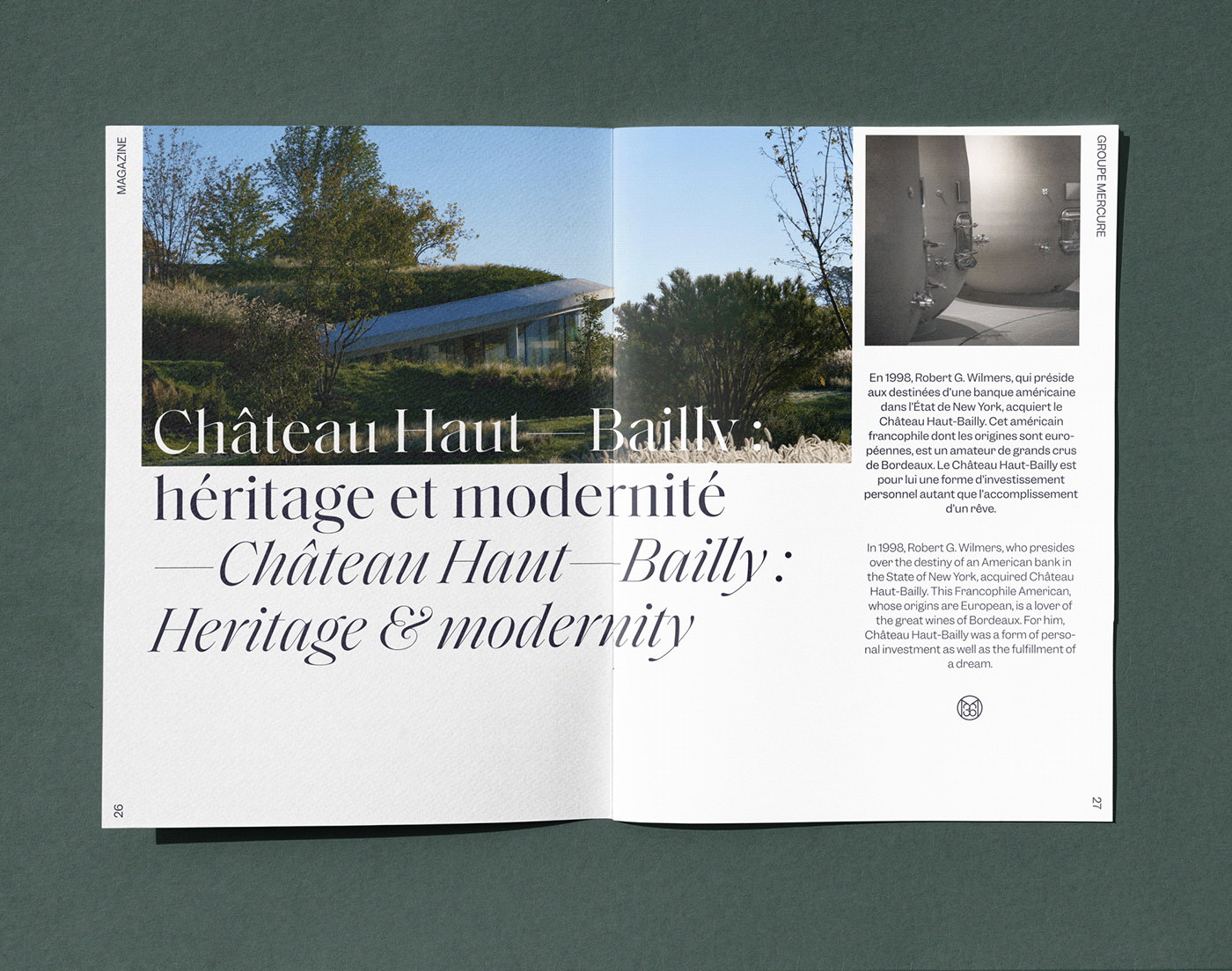
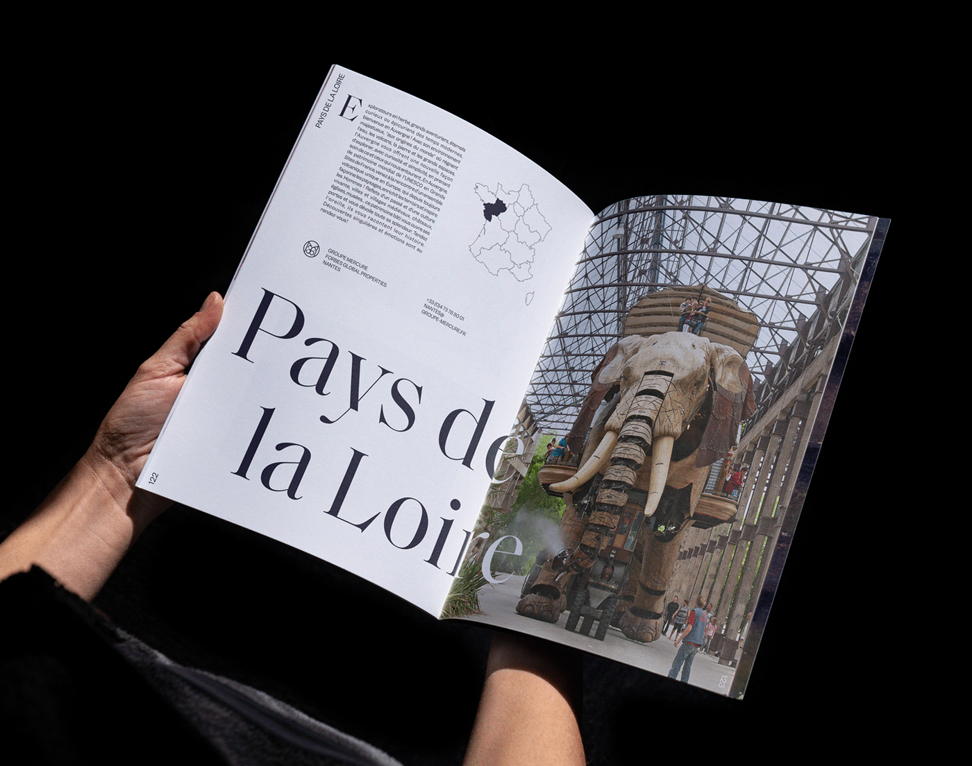
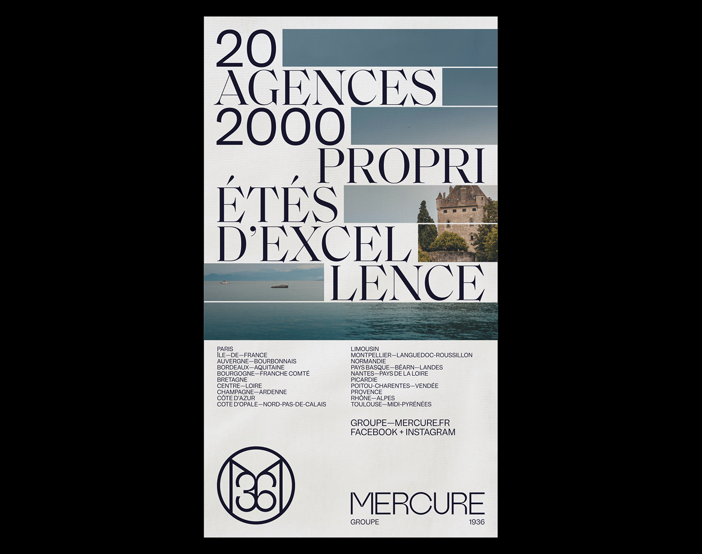
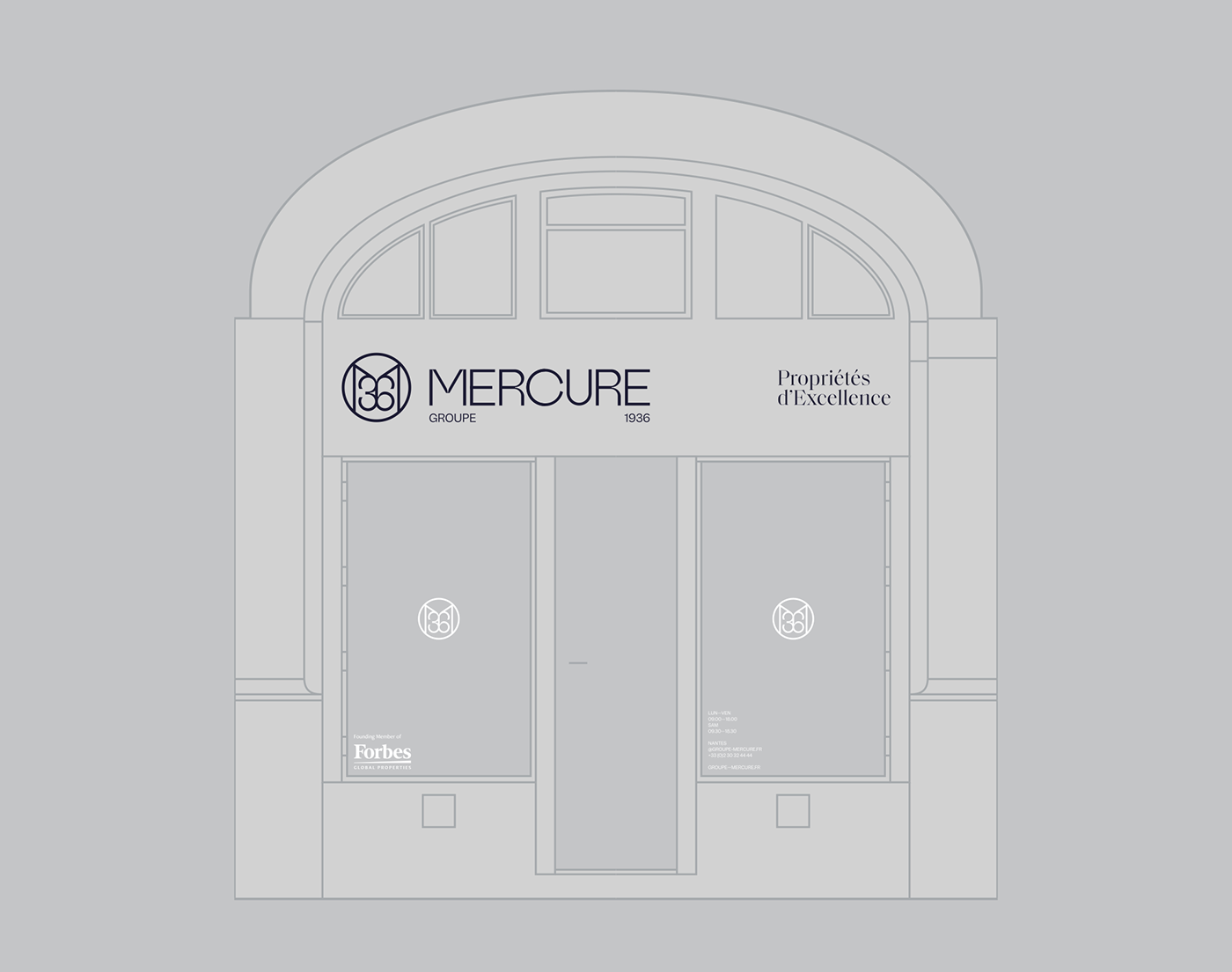
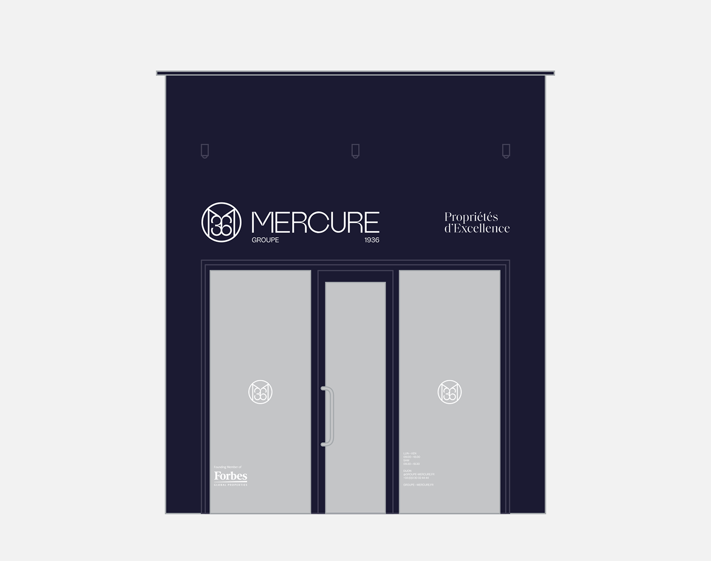
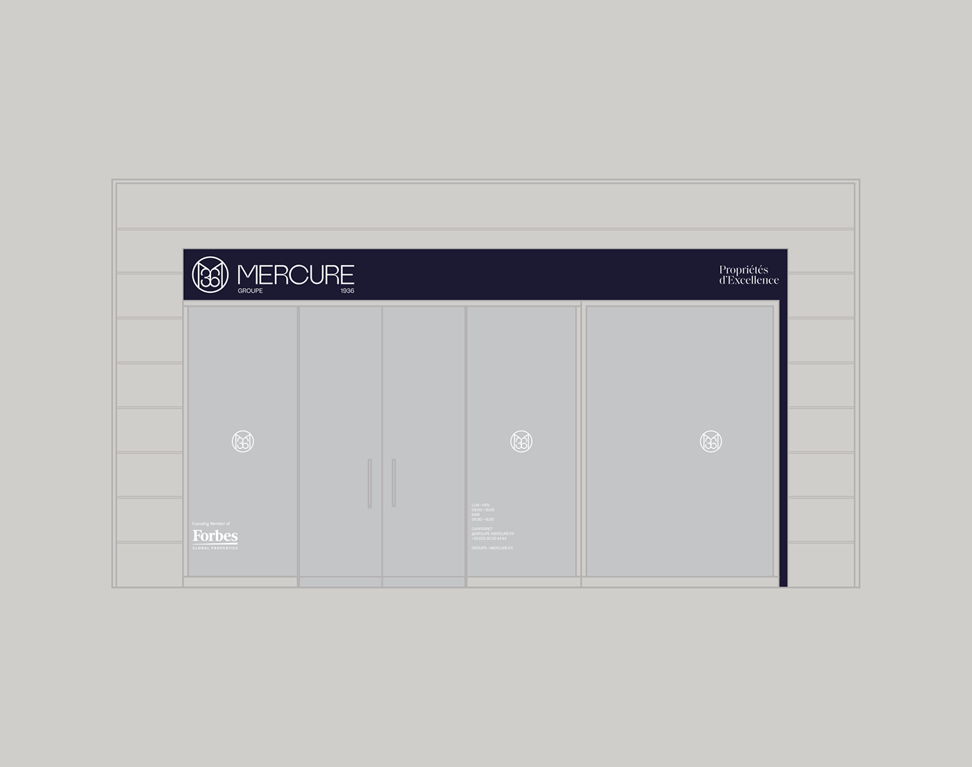
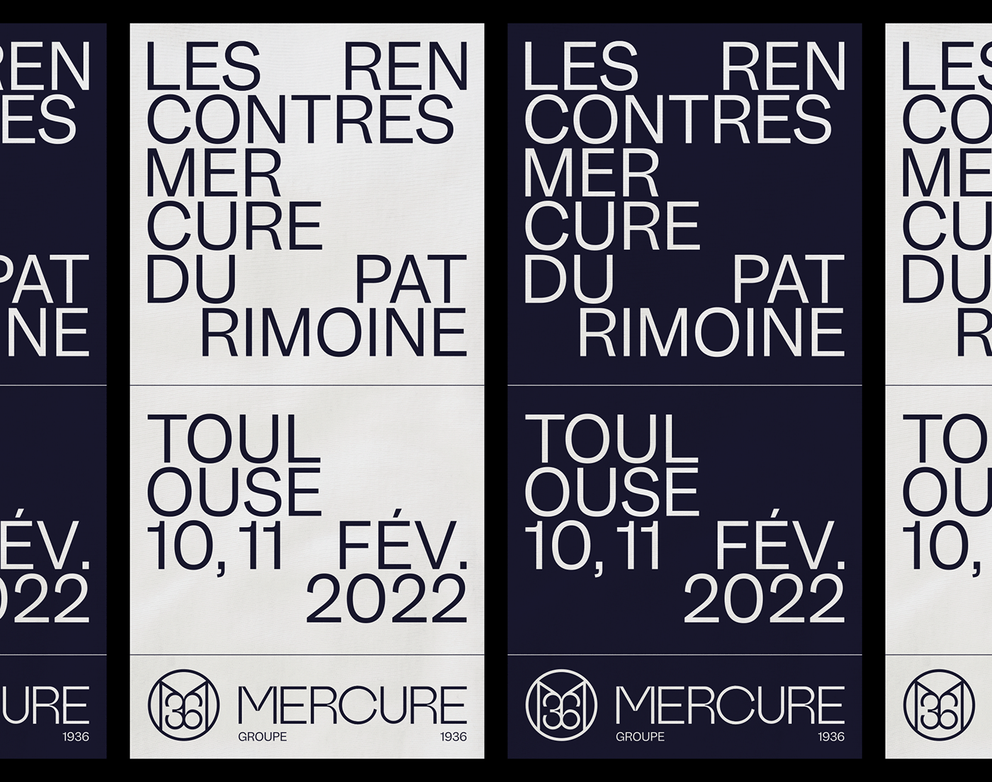
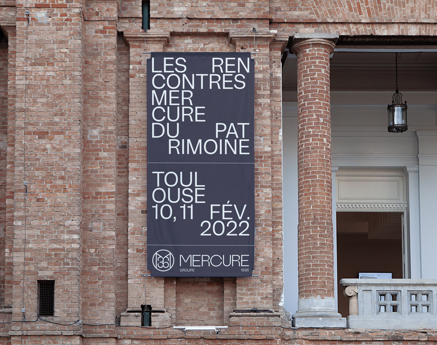
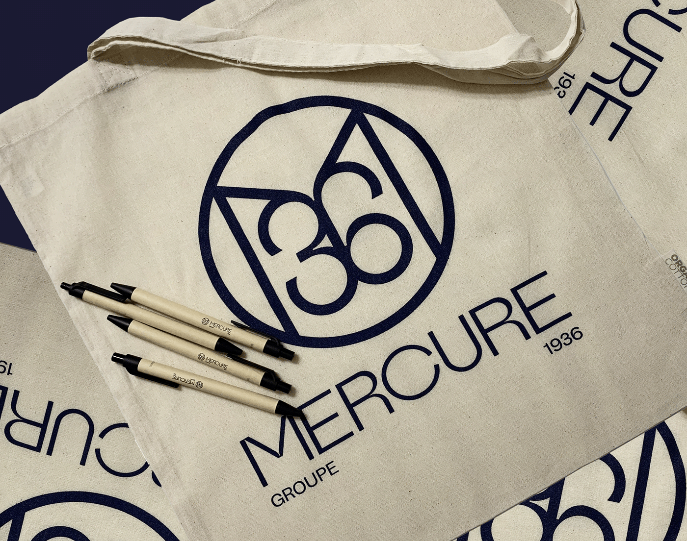
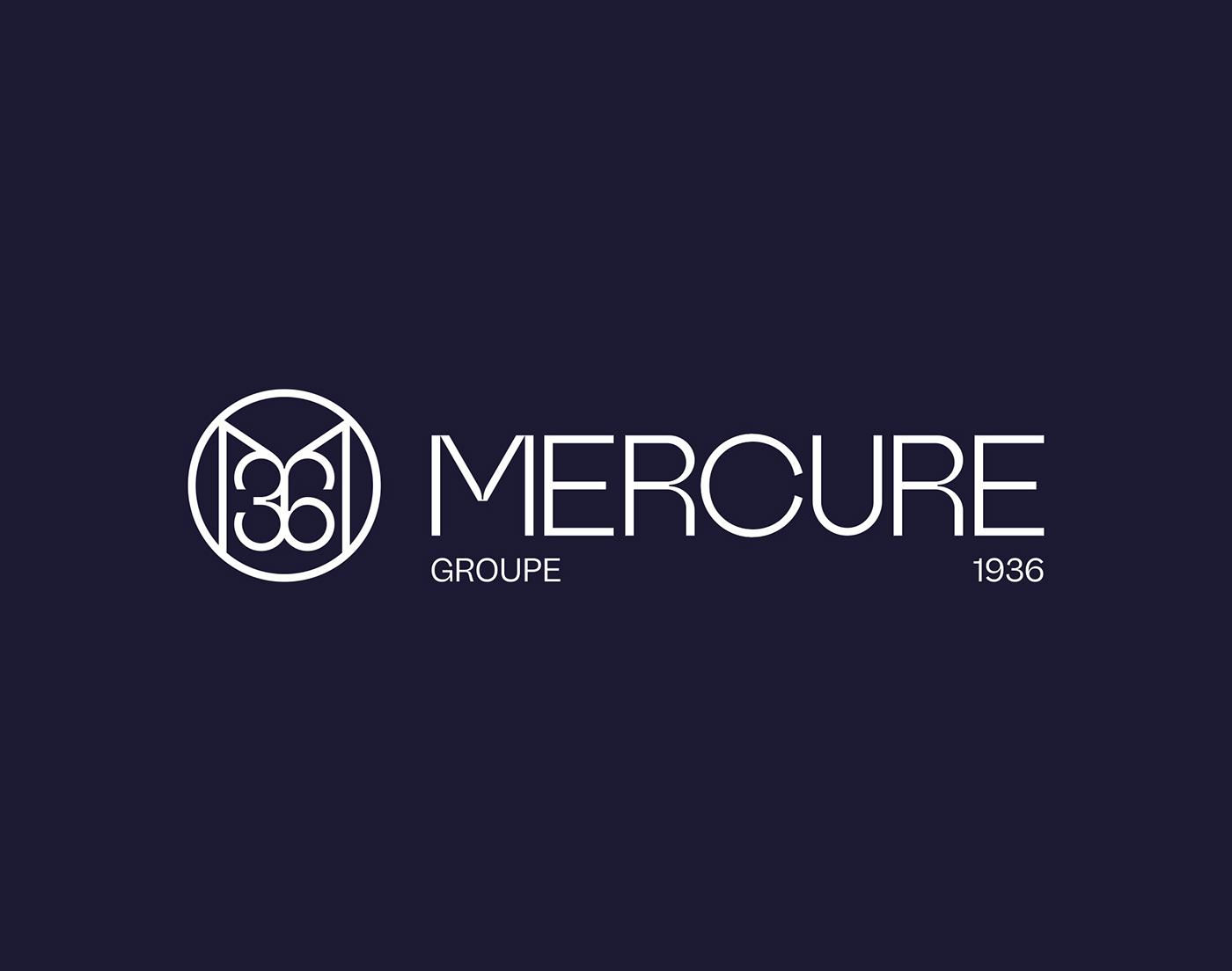
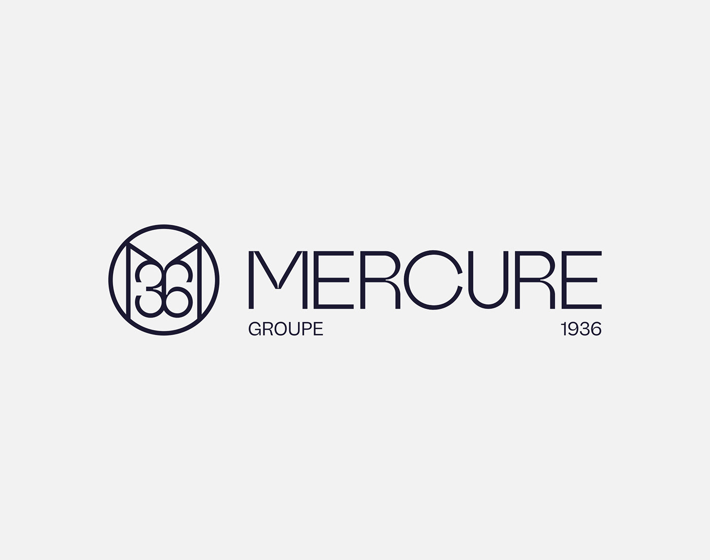
The brand's traditional heritage and the environment in which its teams work oblige us to navigate in a highly codified environment. At the same time, our desire - as well as that of the management - was to take Groupe Mercure towards graphic standards that would allow it to be remembered and to impose a style over the long term. Thus, the new logo is composed of a thin and structured lettering, with optical subtleties that enhance its natural elegance. It is complemented by a monogram "M36" whose characters form a symmetrical interlace that evokes French refinement or a wrought iron gate. This unique approach anchors the brand's longevity at the heart of the graphic identity. We then developed the group's entire visual environment, from its signature ("Properties of Excellence") to the complete graphic standards, including the design of the annual magazine. The reveal of the new branding took place in Paris in October 2021 at the Salon du Patrimoine.
_
FR
Le Groupe Mercure - Forbes Global Properties a été créé en 1936 et se situe dans le top 4 français des réseaux immobiliers dédiés au marché du luxe, avec plus de 2000 biens de caractère à la vente de 20 agences réparties sur le territoire. C'est aussi le leader incontesté sur le marché de niche de la vente de châteaux, en concentrant plus de 80% du parc français. Au printemps 2021, la direction du groupe a demandé à notre studio de repenser intégralement l'identité graphique de la marque, ainsi que sa signature et son système visuel.
L'héritage traditionnel de la marque et le milieu dans lequel ses équipes obligent à naviguer dans un environnement très codifié. En parallèle, notre volonté - tout comme celle des dirigeants - était d'emmener le Groupe Mercure vers des standards graphiques qui lui permettrait d'être remarqué et d'imposer un style sur le long terme. Ainsi, le nouveau logo se compose d'un lettrage maison, fin et structuré, doté de subtilités optiques qui réhaussent son élégance naturelle. Il est complété d'un monogramme "M36" dont les caractères forment un entrelac symétrique qui évoque le raffinement à la française ou un portail en fer forgé. Cette approche singulière permet d'ancrer au coeur de l'identité graphique la longévité de la marque. Nous avons développé par la suite l'ensemble de l'environnement visuel du groupe, de sa signature ("Propriétés d'Excellence") aux normes graphiques complètes, en passant par le design du magazine annuel. Le dévoilement du nouveau branding à eu lieu à Paris en octobre 2021, au Salon du Patrimoine.